Every twelve months the Pantone Colour Institute selects a particular tone that best captures the zeitgeist of contemporary culture. The chosen colour has traditionally gone on to influence every aspect of design and visual culture over the course of the following year, whether by dominating the runways of Paris Fashion Week, seeping into advertising or – of course – making its presence felt in interior design. After careful examination of the currents flowing through our particular moment, Pantone have designated “Greenery” as 2017’s “Colour of The Year”. This yellow-green hue is believed to signify freshness, new beginnings and most importantly a return to nature, an idea that we can all identify with in the hurly burly of our busy lives.
Peace, balance and harmony
Green has a habit of repeatedly asserting itself as a key design colour; as recently as 2013 “Emerald” was selected as the year’s all-conquering tint and the Victorians delighted in covering their walls with vivid forest-green papers. We’re drawn into the embrace of this colour again and again for a number of reasons. Psychological tests have demonstrated that it relaxes the mind and soothes the viewer both mentally and physically. It has been shown to be effective in alleviating anxiety, nervousness and even in helping to reduce symptoms of depression. This is a colour that makes us feel safe and nurtured. In the field of interior design, green communicates the idea of peace, balance and harmony. It can also signify change and transformation. It’s hardly surprising then that this colour in all its permutations should be so popular.
Here at Cotswold Grey we believe in the importance of creating spaces that are as thoughtful and unique as you are. We don’t believe in being slaves to trends so we’ve chosen to take “Greenery” as the starting point for a different sort of design journey. Now that we are in the first flush of spring, the days are lengthening and the sunlight is growing stronger. A gentle blush of colour is beginning to settle over the Cotswold Landscape and it’s this subtle atmosphere that we are trying to capture in our interiors; greens that breathe like Egyptian cotton and rejuvenate the viewer.
A fabulous springboard
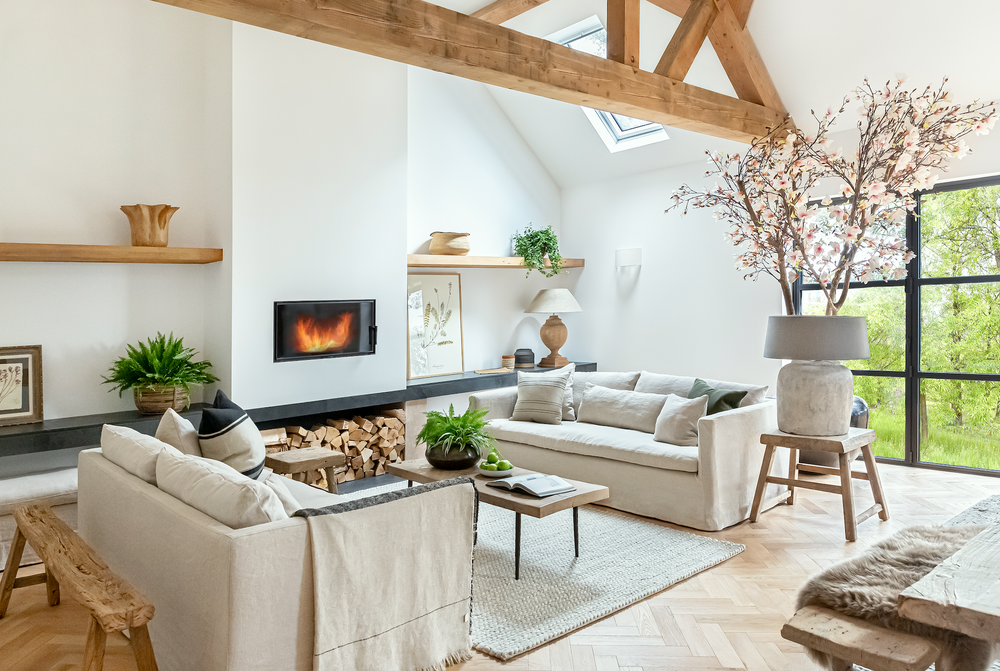
It isn’t necessary to saturate a room to evoke these sensations. Hanging a group of botanical prints on a feature wall will introduce a sense of nature and growth, while an arrangement of foliage and white flowers in a vase will add a softening touch. The use of natural materials such as wood – whether painted or stripped - accentuate this theme and add a sense of depth to your décor. One of the reasons that this soft green appeals to us is that it provides a fabulous springboard from which to accessorise. As a neutral shade it will tie together more vivid tones as well as hints of whites and creams; a plush sheepskin will lie just as sympathetically as a vivid turquoise vase, while splashes of gold will conjure the warmth of the sun on fresh foliage. For sheer versatility, soft spring greens are hard to beat.
A freedom to experiment
The golden rule in this type of interior is unity and green is uniquely suited to this approach. It allows the freedom to experiment while never being overwhelming and will help you to shake off the stresses of the day. Now that the chill of winter is behind us, why not let a little nature into your rooms and luxuriate in the soft charms of this wonderful colour?