Choosing the perfect colour for any space can be challenging because there are just so many to choose from! People are becoming increasingly bold with their interior colour palettes while the wide variety of neutral tones also presents a wealth of opportunity to create truly unique living spaces.
Many people, when choosing a colour for their home, will only consider how it will look in the setting and how it will interact with the furniture. However, for that perfect hue, it’s worth considering the subtle effects certain colours can have on our mental wellbeing.
It’s long been understood that particular shades can evoke specific emotional responses – less well known is that the emotions colours evoke in people can differ. Certain colours can also have memories attached to them, further strengthening that emotional connection.
In this blog, we’re going to look at some of the most common responses to popular colours to help you create the perfect space.
Blue
The colour blue has been known for generations to evoke feelings of calm for its associations with peaceful skies and balmy oceans.
Blue is known to reduce the heart rate of people that focus on it, which partially explains its popularity in the bedroom or bathroom. In these spaces, the right shade of blue can help to relax the mind, helping you to unwind after a long day.
Blue is a very versatile colour that can be used across the home. In communal spaces such as the living room, a brighter shade can add a stylish and stimulating twist while a deep navy creates the feeling of a sanctuary for relaxation.
Green
Sometimes eschewed due to superstition, green is not always the most popular colour in decoration. However, few shades can compete with green when it comes to creating a positive vibe.
With its obvious associations with nature and verdant growth, it can have a calming effect on the mind. Green is also the most restful colour for the eye – an important consideration if you spend most of your day looking at screens!
If you are unsure how to use green in your space, you could introduce it in the form of a stylish sofa or chair upholstered in deep pine green velvet to add an eye-catching pop of colour.
Another easy way to incorporate green is through plants, which provide structural interest and bring nature into your home. If the real thing is impractical, opt for faux flowers and plants to create the same effect with zero maintenance!
Red
In direct contrast to blue, red is known to bring energy and atmosphere to a space, and increase people’s heart rate and adrenaline levels.
A powerful colour feared and admired in equal measure, red can be challenging due to its strength. This feature makes red a colour uniquely suited to social areas, such as the dining room, where it can provide a stunning evening backdrop lit by candle-light.
Choosing the right shade of red is tricky. A vivid hue can look stunning as a statement piece such as a free-standing cabinet or sideboard in Chinese Red - or as tableware. Red can also be very effective and dramatic as a statement wall.
The tone you choose will depend on the aspect and purpose of the room and the effect you wish to create – and whether you will be using the space predominantly during the day or night.
Purple
Purple is becoming increasingly popular as a design colour, perhaps because of the incredible versatility it provides throughout its range.
A combination of blue and red, purple tends to share more characteristics with the former, promoting calm. However, the depth of this colour lends it an incredible sophistication that can evoke a range of emotions including creativity.
The shade of purple you use will make a huge difference to the final ambience of your space. Mauve will help promote calm as blue does, but with extra warmth, which can work wonders for small spaces. A darker shade creates a luxury feel that evokes feelings of romance, similar to red, making it a perfect hue for the bedroom.
Yellow
Like sunshine, yellow naturally stimulates happiness. It amps up natural light and can make a room feel more cheerful. These factors make yellow a popular colour for the kitchen, where its joy-inducing quality can help ensure you start the day with a smile.
Yellow can be overpowering. The old belief that you can have too much yellow still holds true for many people. However, a statement wall or piece of furniture can add a real buzz to an otherwise plain space, particularly when balanced with a neutral grey or white.
Orange
Not surprisingly, given its associations with fire, orange inspires a sensation of warmth. This vibrant colour is stimulating but also playful.
Orange with a predominantly yellow undertone inspires hope and optimism, while a redder tone is livelier with more energy.
Orange can encourage social interaction, thus it’s ideal for a communal space (such as an orange feature wall in your living room).
Neutrals
Neutrals remain the most popular choice for the home. Ranging from grey through white to ivory, cream and beige, grey and taupe (or ‘greige’), neutrals can provide the perfect canvas for statement colours but they play a vital role as individual shades.
- WhiteWhite helps to augment space, making rooms seem lighter and brighter by amping up natural light.
It looks clean and can also induce feelings of purity and innocence, which works wonders for spaces such as the bedroom or bathroom. Neutrals can be combined effectively with each other to create a sophisticated design.
Neutrals can be combined to create a classy harmonious interior design scheme but when choosing which it’s important to select neutrals of differing intensity but with the same undertone (eg. pink, yellow, blue).
A natural stone wall, exposed wood beams or your favourite grey and white rug patchwork could be your inspiration.
-Black
Black is not for the faint-hearted, but anchors and adds incredible depth to a room.
Contrary to popular opinion, dark walls don’t make a space feel smaller but instead appear to recede thus increasing the sense of space. Black walls add drama in a hallway or cloakroom – and a bedroom with a black statement wall can look stunning.
Pure black is most often used as an accent in interior design, to sharpen and anchor a space. Black invigorates neutrals and makes a white scheme pop.
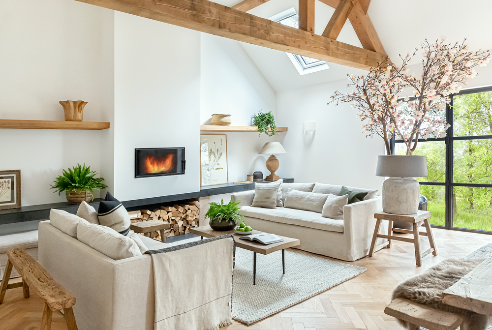
Window frames painted black or charcoal grey help to draw the eye outside to the view beyond.

Finding the Perfect Colour Blend
To create a unique space that works both visually and emotionally, it’s important to pick colours that combine well.
For professional guidance, it’s advisable to use an artist's colour wheel which indicates the best combinations of colours, tones and shades to use.
We hope this guide will inspire you to bring a splash of colour into your space! If you’re looking for more inspiration, why not check out our recent blog on how to add colour to your living room, or ways to brighten a dark room?