It’s official. Grey is the most popular neutral. Embraced by interior designers for its verve and versatility, it has now cast its spell over the rest of us and is finding its way onto more of our walls, floors, ceilings and furniture.
Grey can be dark and moody or – to coin a cliché - pale and interesting and there’s a shade, tone or tint for every situation. Paint specialists like Little Green and Farrow and Ball offer dozens of different greys while the paint charts of mega-manufacturers like Dulux list several hundred.
It’s overtaken white, cream and beige as the wall hue of choice but despite the myriad of options on offer grey is a notoriously difficult colour to work with. Context is everything and the first thing to consider is the light-conditions and aspect of the interior you want to paint. Natural light in a south-facing room, for example, that’s sun-drenched for most of the day will be very different to the cool, even light cast in a room that faces north.

As the vast range in paint charts reveals, grey comes with many different undertones and the endless combinations ensure no two rooms will look the same. Understanding the components and characteristics is key to using grey successfully. A cool grey with blue undertones, for example, can work beautifully in a south or west-facing room where it will balance the warm and at times intense natural light, while a grey with undertones of red /pink or purple/mauve which give it warmth would be a better choice for a space with a northerly aspect.
Context is also important when it comes to the room itself. Dark grey walls can look moody and chic against a white ceiling and skirting boards – or paint one feature wall if you’re not sure you want to go the whole way. Add monochromes to the mix to create a sophisticated interior scheme. A luxurious black faux fur throw or a Berber style wool rug with dark diamond patterns on a white background will bring warmth and softness to your scheme.

Grey can be the star of your show or the backdrop for your choice of colour. Hues that look good with grey include warm oranges, yellows, pinks and reds. Add brights such as zingy fuchsia or burnt orange - which pop paired with grey - for drama; or coral for a softer, more subtle scheme. Cooler colours can also come into their own: teal or turquoise, lime or chartreuse will give your room a contemporary vibe.
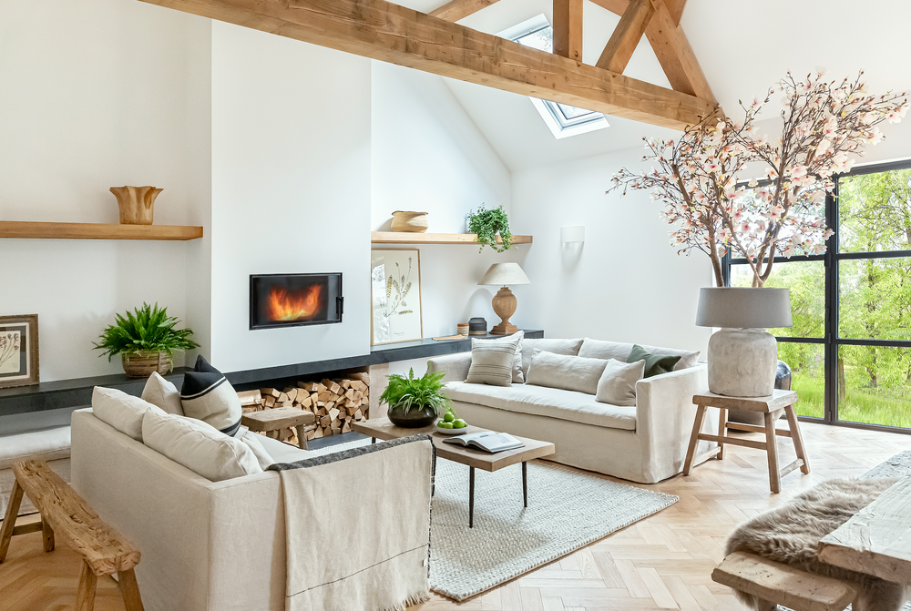
Grey can be sleek and urban or calming and rustic. Balance it with warm neutrals like cream and sand to create an interior that looks effortless and inviting. Natural wood floorboards and old oak beams in a country cottage or farmhouse are the perfect foil for pale grey walls which will look calm and welcoming – and less stark than white. Wood in general is great with grey: antique or contemporary furniture is set off beautifully against the backdrop of a grey wall. And pieces of all styles and periods can look wonderful stained or painted grey: from a shabby chic sideboard to a gorgeous Gustavian bureau.

Metallics work wonderfully well with grey: a metal-topped table with its own unique patina will add textural interest as well as bringing a subtle dose of grey into your scheme. Gold and copper can add drama and contrast. A copper dining table provides a stunning centrepiece to a grey room particularly at night lit by candle light; an ornate gilt-framed mirror can make a glamorous statement on a deep grey wall.